Back to the College Football Uniforms
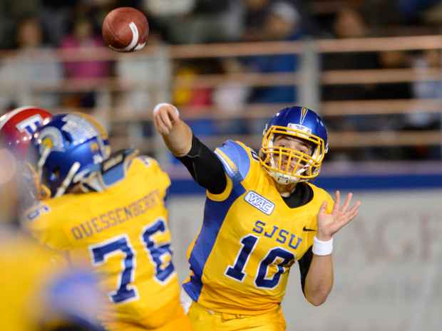
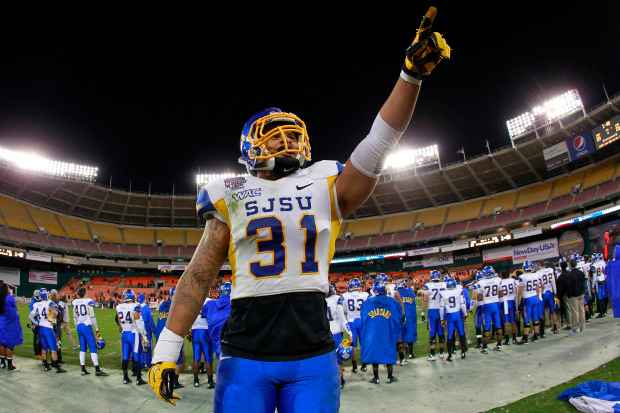
It appears San Jose State and Nike, at least for the time being, has settled on a uniform for the foreseeable future. In 2012, the Spartans moved to a “SJSU” wordmark across all jerseys for the first time in school history, eliminating “SPARTANS” and “SAN JOSE STATE” altogether from its tops. The vertical “SPARTANS” wordmark can be seen across three colors of pants — yellow, blue and white — but it’s no longer a central piece of the uniform.
The football program also went back to its singular “Spartan helmet” primary logo for the shell sticker last seen in 2005. From 2006-11, San Jose State used versions of an attacking spartan with a pointed spear, a secondary graphic. An interesting feature is the program’s center helmet stripe. Instead of the basic vertical decal, San Jose State’s using a spear.
Currently, jerseys are tri-color with contrasting rib vents and sleeves. There’s an all-yellow option and all-blue among several other combinations. The swoosh has decided to stay away from San Jose State’s black alternate past in the early 2000s, one of the most hideous combinations in the uniform era of college football.
From 2006-09, Nike’s uniform template was categorized by thin piping and angled vectors, thus creating a similar apparel look across the majority of swoosh-sponsored programs in non-BCS conferences.
If you’re not a member of Nike’s elite, receiving your own school-specific design is a rarity.


