Back to the College Football Uniforms
Brand refresh.
That’s the popular phrase uniform enthusiasts are calling grand unveilings in the apparel age.
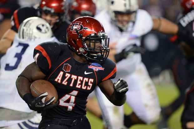
In May 2013, the Aztecs released a “cohesive brand identity” across all 19 sports with the biggest changes coming on the gridiron. San Diego State’s primary logo has been altered to an interlocking “SD” with a spear going through both letters. Typefaces have switched to a more modern look and San Diego State’s new candy apple red helmets now feature the updated logo.
Current uniforms use Nike’s new ‘shoulder stripe’ template, a generic jersey with triple-striped shoulders. On the Aztecs’ home white, stylized black numerals are beneath a blocked “SAN DIEGO STATE” wordmark — instead of “AZTECS” the previous year — and a primary logo at the crest.
A single red stripe is located on each shoulder with black stripes as borders. The inverse can be seen on San Diego State’s home blacks. The Aztecs were one of college football’s first teams to step outside the box at the turn of the century when they unveiled ‘color fade’ helmets for the 2001 season.
The red shells that faded to black near the earholes lasted until 2005. Now, several teams use two-color lids including most recently Arkansas. In the past with Nike, the Aztecs’ two-color wordmarks on jerseys were too vertical causing a blur to the eye. Instead of three stripes of the same size on shoulders, one large stripe gave way to contrasting piping.
Let’s just say the swoosh’s 2013 redesign was for the best and should cause less confusion on gamedays in the apparel department.


