Back to the College Football Uniforms
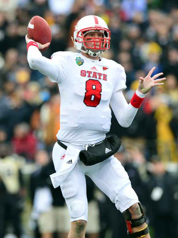
The Wolfpack have dropped the “N.C.” off of their traditional wordmark and flaunt “State”, a nod to the university’s “We Run This State” campaign. Ironically, all three of N.C. State’s Final Four teams (1950, ’74, ’83) donned the same “State” across their jerseys. According to the athletic department, the Wolfpack’s 1991 baseball team was the last team to wear the “State” wordmark prior to the football program bringing in back in recent years.
From 1963-85, N.C. State used an oversized “S” as its primary logo. The Wolfpack transitioned to an updated diamond-shaped “NSC” in 1986 and donned that decal on their shells for the next 14 years. Chuck Amato brought back the classic “S” design in 2000, this time with an “N” and “C” added between the curves in the letter.
The school’s red and white primary colors clash well with arch rival North Carolina, but a touch of black was added to gameday shells in 2007 for a more menacing look. Black came full circle from Adidas in 2012 when Techfit alternate tops and pants became a part of N.C. State’s football garb. The black pants with wide red and white stripes looked great, but the tops with pink numerals to raise awareness for breast cancer didn’t match.
Dark tops and pants caused a nearly instantaneous stir considering black has never been a uniform color in Raleigh.
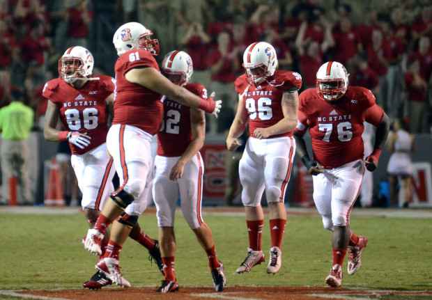
Red-on-red is a current fan favorite at home and in 2011, the Wolfpack introduced red helmets with a white logo to match for the first time since 1999. A subtle recent switch is incorporating the current “Block S” helmet and pants logo into the S in “STATE” on the front of jerseys. N.C. State signed a four-year extension with Adidas in the spring of 2012, choosing the three stripes over negotiations with Under Armour.


