Maryland Terrapins Football Uniforms
Back to the College Football Uniforms
Maryland is Under Armour’s flagship school and for good reason. The Baltimore-based company was founded in 1996 by CEO Kevin Plank, a former special teams captain on the Terps football team. To compete in an industry dominated by Nike, Under Armour has outfitted the Terps in several loud looks in recent years earning the nickname “the Oregon of the East Coast”.
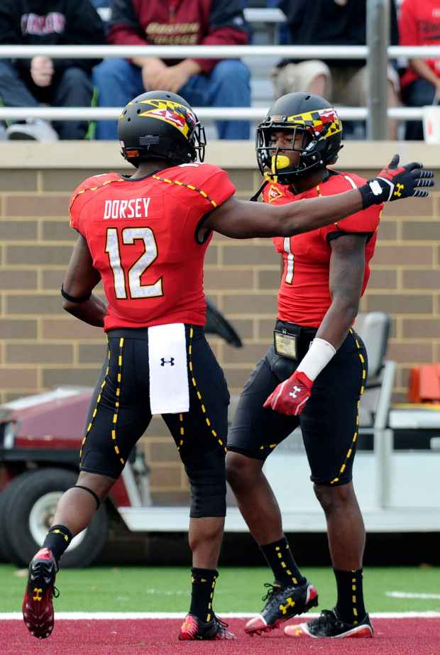
Maryland went to its current “turtle shell” helmet motif in 2011 to match Under Armour’s jersey and pant creations. The off-white dome is speckled with silver to mimic the back of a turtle shell. Since that opener, the Terps have worn eight different lids on gamedays. Some of the most interesting black, red, yellow and white jerseys combinations have been paired with yellow or dark helmets created a noticeable contrast. Each jersey features color-change numbers, a nifty look.
Before Plank and UA “rebranded” Maryland’s football look, the Terps usually donned red and white with yellow accents with a more traditional appeal. From 2001-10, Maryland’s helmet of choice was a white shell with “Terps” in cursive red lettering, an ode to the 1980s. From 1992-2000, Maryland preferred a black helmet with an “M” logo wrapped in the state flag – relatively tame compared with current styles.
In 2011, Under Armour really pushed envelope at Maryland with a “split” helmet that featured two opposite designs on each side to correspond with differing patterns on shoulders of the white jersey. The bold “State Pride” uniforms, complete with pants that featured “muscle-boosting, core-stabilizing technology”, had a matching base layer that seamlessly connected helmet-to-shoulder-to-arms-to hands. Students loved the get up, but uniform critics not so much.