Back to the College Football Uniforms
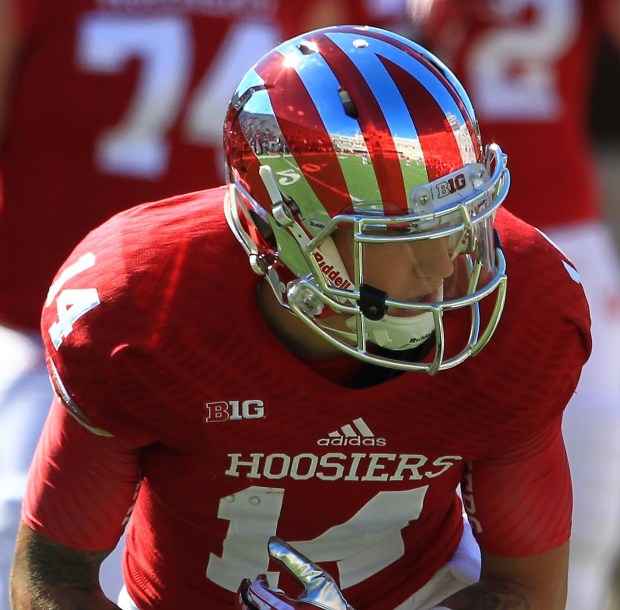
Indiana went with a traditional uniform overhaul in 2011, allowing Adidas to replicate styles of yesteryear to give the Hoosiers a classic look for the future.
Indiana’s current look borrows from Oklahoma’s style – simple crimson tops with “Hoosiers” across the crest and white numerals. White stripes are on the sleeves. White pants feature wide crimson stripes. Stripes on the shoulders were removed. The Hoosiers went back to the same white facemasks that adorned crimson shells from 2004-04 and threw out the cream and crimson stripe across the top of the shell.
The Hoosiers adopted their current interlocking “IU” logo in 2002, switching from a distinctly different “IU” inside of a red circle that never screamed Indiana. Black shells with the aforementioned circle graphic were the on-field choice for a four-year span in the late 90s but haven’t been seen since.
In 1983, the Hoosiers went outside their normal color scheme under coach Sam Wyche and added gold to the mix, incorporating the metallic hue into an aerodynamic logo on red shells with gold facemasks.
Pink was added to helmets and uniforms for a two-game stretch in 2011 in support of National Breast Cancer Awareness Month. In recent seasons, the Hoosiers have donned white helmets with the interlocking “IU” graphic on occasion, but the shell isn’t considered an alternate. It’s the first time Indiana has worn white lids since the 1966 season.


