Back to the College Football Uniforms
Pitchforks are more intimidating than devils carrying pitchforks.
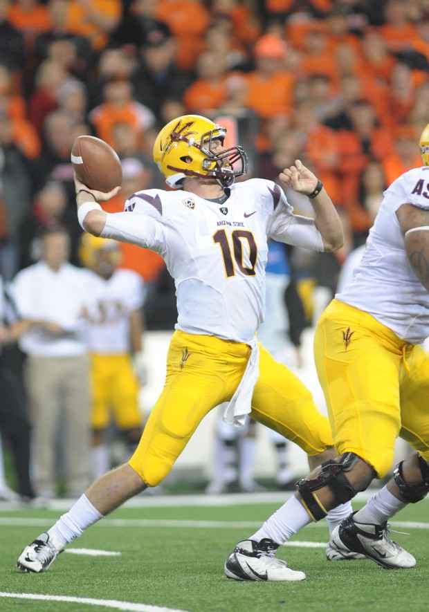
At least that’s what Arizona State football thought in 2011 after Nike’s uniform revamping. ASU’s “Sparky the Sun Devil” logo that lasted for three decades on helmets and uniforms is no longer there, replaced by a three-pronged trident that points toward the opposition.
The swoosh’s massive redesign includes color-fade numerals on the Sun Devils’ black alternates, Flywired collars on each new top and a Pat Tillman logo at the crest. Numerals on sleeves have been replaced with “ASU” stitching and slanted stripes have been added below the shoulder.
Prior to Nike’s radical change, the Sun Devils’ maroon and yellow combinations in the 2000s weren’t very appealing. ASU donned the same yellow shell, maroon facemask lids for 15 years before the switch.
In 2004, ASU’s first season with the swoosh after five years with Adidas, the “Arizona State” wordmark across all tops was decreased to its current size and contrasting necklines were added. Six years later, Nike altered the Sun Devils’ uniforms to a more classic look for one season before incorporating the menacing trident logo in 2011.
On gamedays, the Sun Devils currently have the option of white, maroon, black or yellow helmets. ASU’s classic “Sparky the Sun Devil” logo is small, but can still be found on the backs of shells near the neckline. ASU’s existing Nike contract ends in 2014.


